What’s new in the Frappe and ERPNext V13 redesign?
Here’s a sneak peek at the modern UI and UX elements in an attempt to create a better user experience
Ever since Frappe was born, one of the visions was to build high-performing products. Frappe has always believed in providing delightful value to the end-users by striking a sound balance between quality, consistency, and innovation. With the passing years, the minimalist design movement became a fad and we drove our inspiration from Apple. As a sign of forward progress, we decided to inculcate them into our new project.
Our attempt to modernize the UI. What is modern UI?
Modern UI refers to the user interface design philosophy concentrating on clean lines, large fonts, and the display of simple information. Allowing your page to breathe and creating a smooth experience for the users. Under the guidance of Steve Jobs, Apple famously led the trend of the minimalistic approach with the release of iOS7 which was nothing short of exceptional. This encouraged the team at Frappe and they took a leap and decided to implement the simplicity by making incremental changes to UX giving the UI a major haul.
The team was unsure if they should only refactor the design aspect or the entire frontend code. On the technical side, the major discussion was whether to rewrite the entire frontend using VueJS and Tailwind for the CSS framework or to continue using JQuery and Bootstrap. Later they decided to go with Bootstrap 4 since the previous framework used was Bootstrap 3, so the switch would be a lot faster.
The team rewrote the components only wherever it was necessary and otherwise worked on the facelift. One of our engineers, Suraj, humorously describes this work. He says, “Facelift is make-up. You enhance it with the necessary code to make it look good. But, restructuring is similar to plastic surgery. You dig deeper and work on each detail to make it look finer.”
Major changes
Our goal was to keep the interface simple yet modern. Since ERPNext is a big project in itself, the redesigning phase was lengthy, and to track the internal work, the Framework team used the Kanban method.
Lists, forms, dashboards, reports, e-commerce, kanbans, all were given a major facelift. The below-mentioned screenshots contain a comparison between the legacy designs and the new ones. Here’s a walkthrough of the vivid changes you can expect.
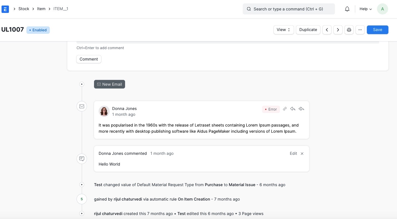
Form and Timeline
One of the major focus areas of the redesign was effective space utilization. Form view now supports a 3 column layout, earlier, buttons used to consume 2 lines, and now it is adjusted in 1 line. Increasing the horizontal area and somewhat reducing the vertical area leaves a large click surface while saving some space.
Other changes are a card-based layout instead of using borders for separation, font contrast has improved, buttons have a better shape.
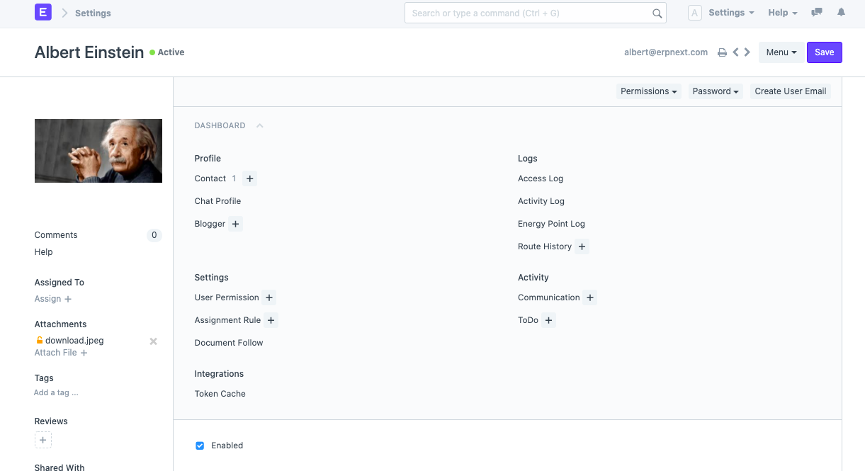
(Before)
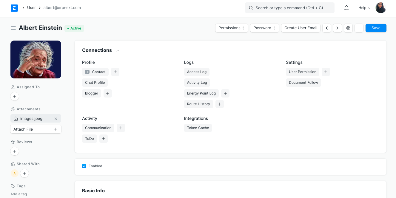
(After)
The Timeline was one component that was fully refactored and now even has new features like a communication toggle switch. This allows you to switch to an only communication view, getting rid of all bulk added by timeline items like views and assignments. The yellow highight in the previous timeline looked faded, now it appears clean. This was a major UX pain point in the old design.
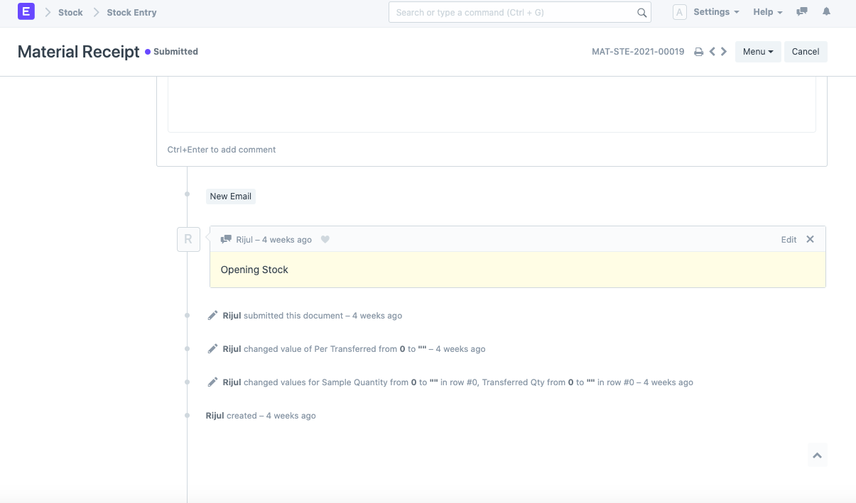
(Before)
(After)
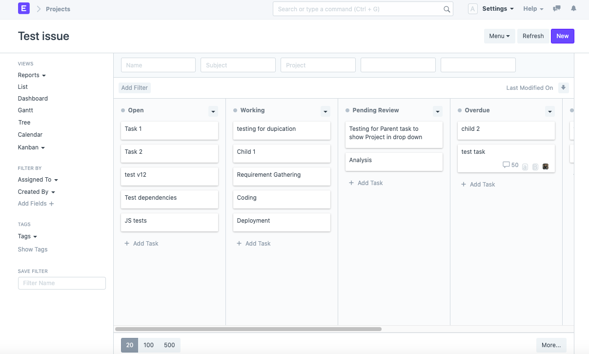
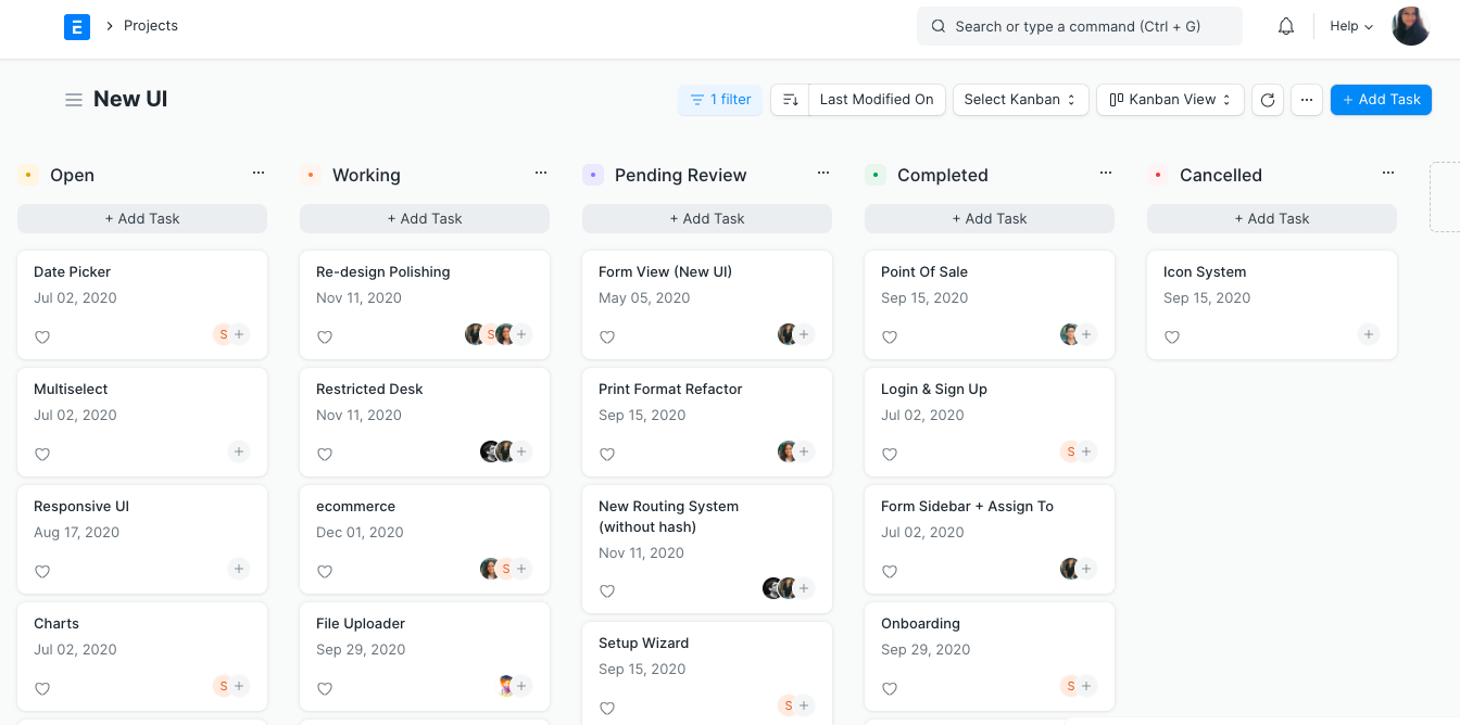
Kanban
Kanban board is a visual way to manage tasks and workflows with columns and cards. When we use Kanban our focus is on cards, therefore, we have removed the sidebar and extra space is gone. Stripped away all unnecessary imagery. Now, we can showcase titles and dates. We have increased the size of the cards which helps in adding more valuable information. It looks less bulky with lighter lines and no borders.
(Before)
(After)
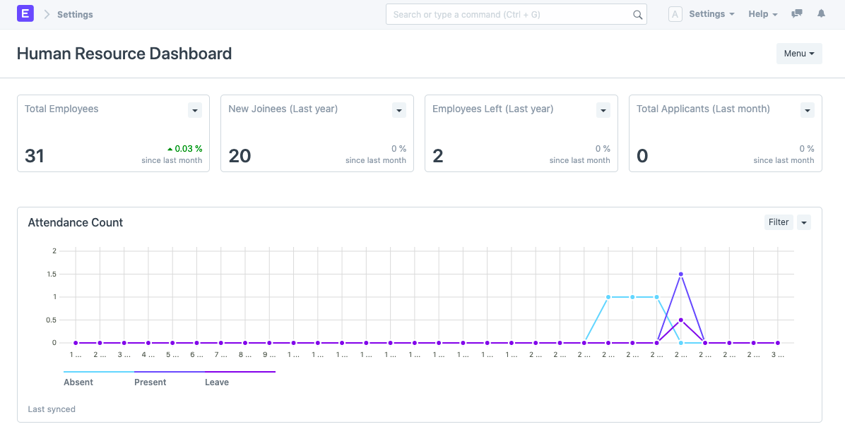
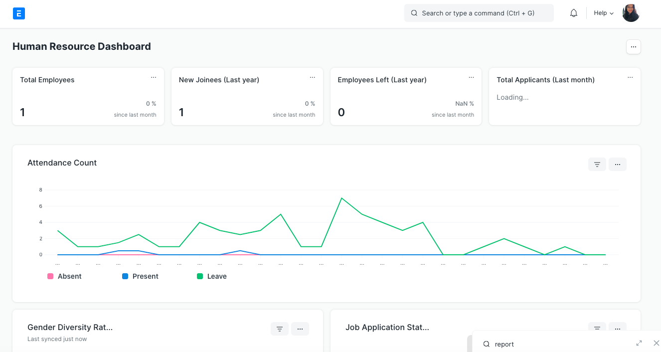
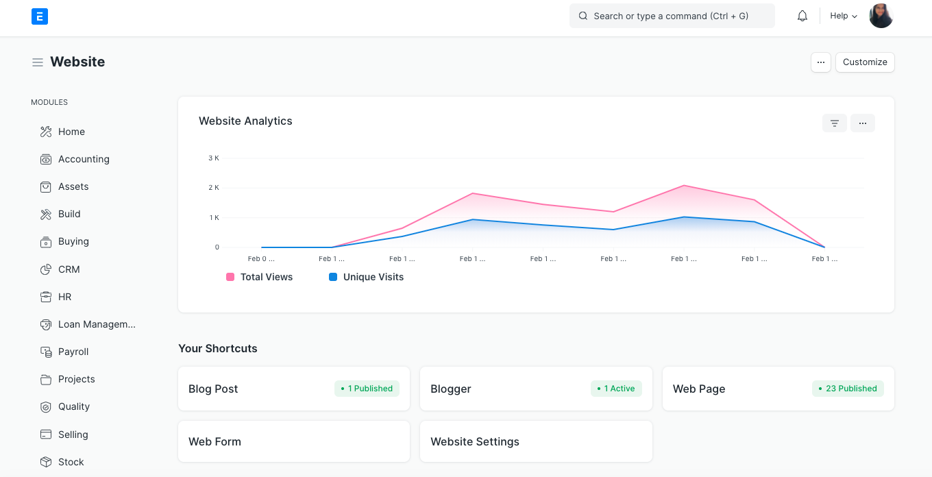
Dashboard
Chart designs are enhanced now and they look modern. Unnecessary borders have been removed. From removing dots in the graph to showing a more readable legend, everything is an attempt to make the dashboards more visually appealing.
(Before)
(After)
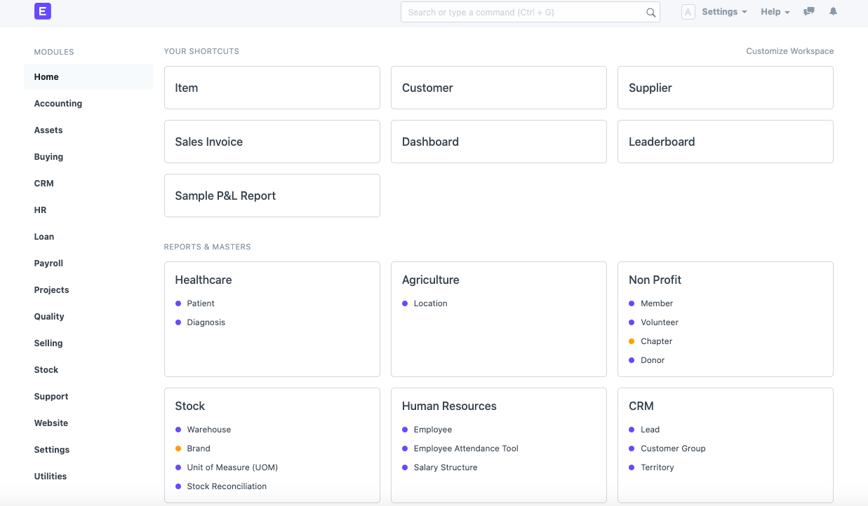
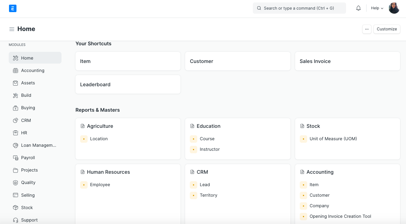
Desk
The module list on the left has icons for each module so you can associate that icon with the module and navigate faster as you get used to it. Shortcuts and forms below are in sharp white while keeping the background gray for finding and opening forms faster.
(Before)
(After)
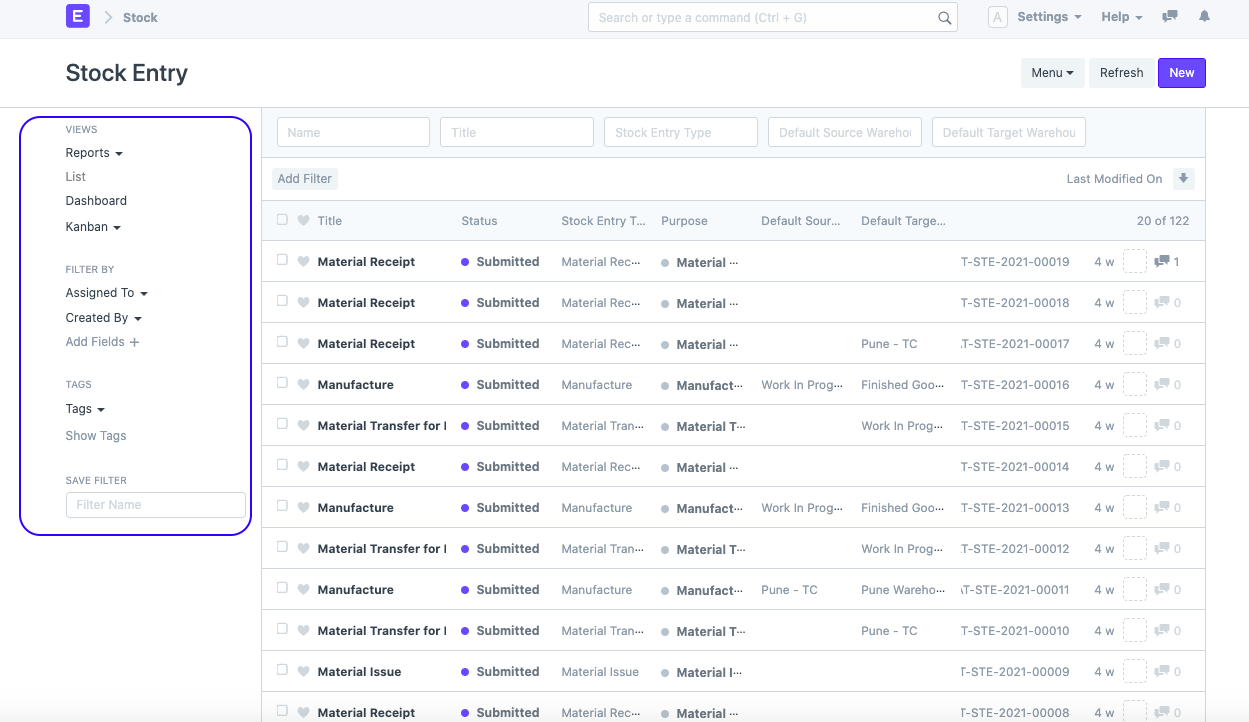
List View
Earlier, in the list view, the view switcher was on the sidebar on the left. Now, you will see it on the top, on the right side. Filters used to take up additional two lines, now it’s just a single button.
(Before)
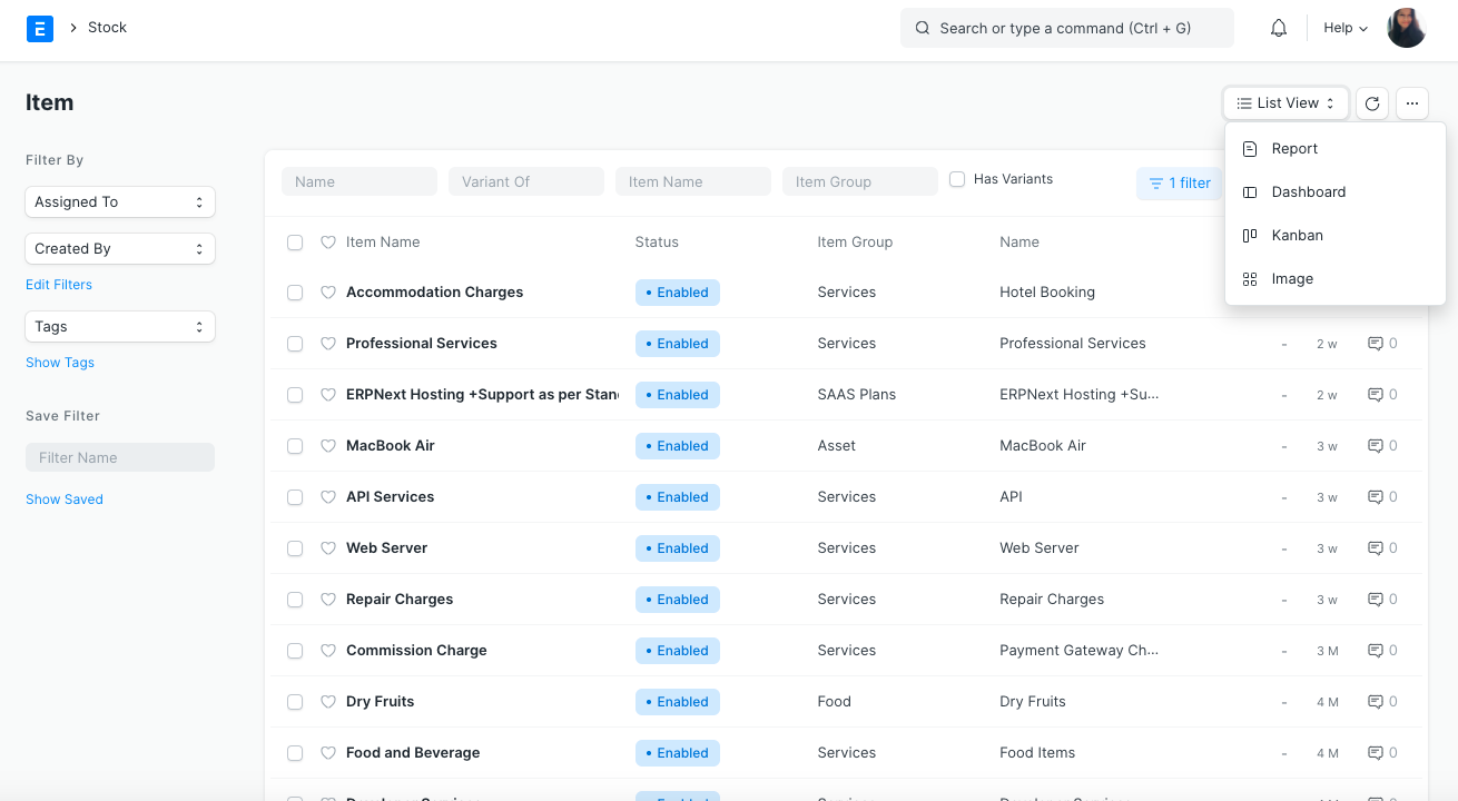
(After)
Logo
The goal of the branding was to project a brand that is minimal and aesthetic. After working on Frappe Books, the team got into a discussion with the design agency, Timeless and they collectively decided to work on the branding for ERPNext and Frappe. The logo has changed, earlier it was in purple, now, we have switched to blue.
.png)
(Before) (After)
Dark theme
Initially, a dark theme was not on the list. However, during the redesign, the CSS was structured such that all the styles were based on CSS variables, making it very simple to introduce different themes. The next step was to get a dark theme design from the Timeless team after which we quickly updated the UI elements for dark mode. Then with just a few UX enhancements, our dark mode “Timeless Night” was good to go! Users who are looking for interfaces with more contrast, we heard you :).
(Frappe Light)
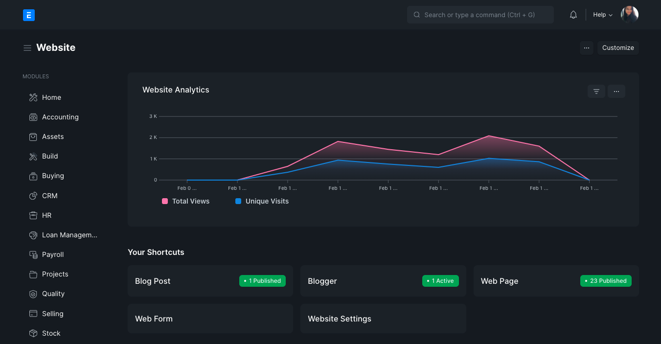
(Timeless Night)
The wrap-up
The V13 project including redesigning took approximately 18 months to come to life, only intending to delight its users and be of great assistance. At the end of the day, the Frappe team strives hard to get creativity, consistency, and a great user experience on the table. With new techniques, designs, and innovations popping up every year, the team is constantly working on the product that fits with today's time and yet not losing on the legacy charm. To a better start for a beautiful tomorrow, here's the new ERPNext for you.