How point of sale in ERPNext underwent a transformation and ended up getting a makeover too.
Learn how the intersection of speed, UX, and UI changes resulted in a significantly better point of sale in ERPNext
Up until V12, the point of sale feature in ERPNext was somewhat underwhelming. Functional, yes, but shy of a fuller experience. When Saqib Ansari from engineering started working on it in early 2020, he had no idea the transformations POS would go through to result in what it is today.
It all started when one of our customers requested a few changes to the old POS system. Thousands of POS transactions daily was a regular thing for them. But they had a problem. The transactions weren’t fast enough. Since the transactions took a longer route in ERPNext, the reports were also a bit slow for a good user experience. This became more apparent with their increasing number of POS transactions across branches.
Along with Rushabh, when Nabin from engineering introduced the challenge, Saqib took it up with enthusiasm. Incidentally, a major UI revamp was also around the corner for ERPNext. It would introduce more challenges in Saqib’s way.
Now, let’s see what happened.
Old POS system in ERPNext and its challenges
To understand the changes better, we’ll have to understand the older system’s shortcomings.
Previous POS challenges
Saqib explains. Overall, these were the software challenges:
- Each transaction from a POS screen created a Sales Invoice. This was a little time-consuming since it updated the Stock and Accounting ledgers every time.
- To keep up with POS needs in terms of quick invoice creation, the submission process needed to be modified. The idea was to leave behind the tedious invoice creation process.
- Other enhancements were planned to the opening and closing of a day to better record POS activity.
- The old POS UI and UX weren’t great.
UI shortcomings
In the older system, there were also certain UI aspects that fell short.
- The older interface’s static item selector took 60% of the screen even while checking out and during payments.
- There were annoying popup dialogs everywhere for things like:
- Selecting Serial and Batch numbers
- Payments
- Printing receipts
- There was no visual feedback for any action taken on the screen. For example, increasing the rate didn’t have any visual feedback.
- The taxes section was confusing.
- The numpad position wasn’t easily accessible.
- It lacked customization options. For example, users cannot add custom fields to the screen.
New POS system in ERPNext
Ok enough about the old, it’s time to see what’s new.
Why it’s faster now
Here are the changes Saqib added that made the new POS faster.
- Each transaction from the POS screen now creates an intermediate invoice (called POS Invoice) which doesn’t update the stock and accounting ledgers to keep it as fast as possible. This is also called a “sub-ledger”. Separating the POS ledger from the General Ledger makes the system a lot more scalable.
- The stock and accounting entries were now created at the end of day while closing a POS session by a single sales invoice which merges all the intermediate invoices created throughout the day.
- This single consolidated sales invoice only creates 3-4 ledger entries. The older system would create n x 3 ledger entries where ‘n’ is the number of invoices created throughout the day.
- Since drastically fewer ledger entries are made, the load on the general ledger is also eased, making it faster.
Good UI, better screen usage
When he was about done with improving the transactional performance, UI improvements were also on the list. Point of sale in ERPNext also saw the following UI changes:
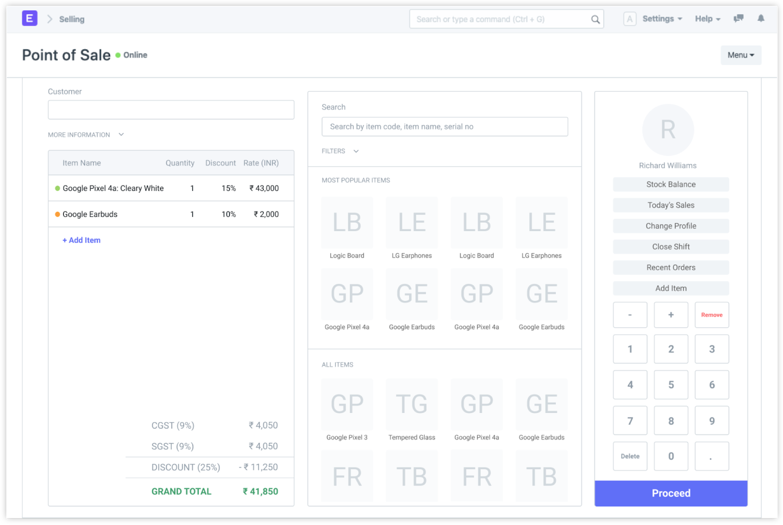
- The item selector now shrinks while editing item details, it hides on the payment screen.
- The numpad is now on the right-hand side for better touch interaction.
- In the item details screen, the rate and quantity give a visual feedback when changes are made.
- All the dialogs and messages are replaced with alerts.
- The payment dialog is shifted to another section.
- From POS settings, users can now add custom fields.
Here’s one of the POS design iterations:
The POS makeover process
When Saqib started on the POS project in January 2020, he started with a detailed design spec on three key areas:
- Creating a faster POS Invoice instead of a Sales Invoice from V12
- Stripping down all the Ledger and Stock posting code from submission of POS Invoice to make it faster
- Creating a POS Closing Entry to merge the POS Invoices into Sales Invoices so that all ledgers show accurate data
Initial demo and feedback
After he started working on improving the point of sale system in ERPNext, Saqib initially gave a demo on creation of POS Invoice and merging it into Sales Invoice.
Although the problem at hand wasn’t UI design, it sparked his interest. Saqib spent a considerable amount of time to give redesigning POS a shot, we’ll see the results in the coming sections.
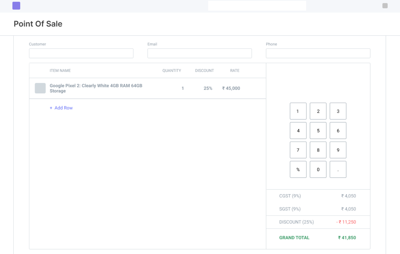
Initially, these were his intentions with POS:
- Quick transactions with almost no dialog or popups
- Fill the need for a lot of buttons at your fingertips
- Automatically focus on next required fields
- Optimize for both keyboard and touch screens
- Better selectors for Item and Customer
Keeping these things in mind, this was one of the initial designs he came up with:
When he showed around his first cut, there weren’t many reactions. Slightly disheartened, he focused on other areas of POS like.
- Merging Return POS Invoices into Credit Note
- Improving Serial and Batch selection in POS
- Better Shortcuts
- Fixing Stock Validations
The POS design grind
But of course, he hadn’t given up on redesigning POS and he worked on a few more iterations with minor improvements.
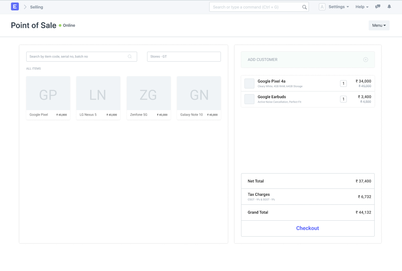
For this, the most common feedback he got was "there are too many buttons on the screen". But after reading through all the ERPNext forum posts, a key idea stuck with him—POS Users need all the actions at their fingertips.
The idea of a traditional POS design was set aside and in the following weekend he browsed through popular UI design websites to draw inspiration for a POS screen. Keeping a few on his screen for reference, he started working on the design for the third time. He didn’t wait for the open day and got some immediate feedback from colleagues.
And here's that design:
The community chimed in
After polishing the design further, he eventually posted it on the ERPNext forum in May 2020.
Saqib reminiscences, “Discussions on the forum were a scary experience for me as it got a LOT of traction. Part of the reason was that we put up a test site with the new design, so everyone had an early look and gave their feedback.”
Offline POS had to be let go for now since its compatibility with the new design was problematic. At the end of a three month long sprint, the feature was almost finished and is his first major project. After many more fixes, changes, and testing, the new POS finally was merged in the seventh month of 2020.
Yet a newer design
When collaborating with designers for V13 redesign, POS also got a fresh makeover in September 2020 which was implemented in the month of November.
Here’s what the POS screen looks like after all that:
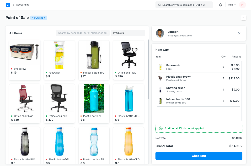
Fueled with the final redesign touches, Saqib says that this marks the end of the coolest project he has worked on so far.
What's next?
The next time Saqib works on point of sale, he expects to be tackling offline POS and a separate POS desktop app, like we have for accounting called Frappe Books.
Prasad Ramesh
Marketing at Frappe.
How will e-invoicing be effected after this change?